
A data table can be a pain to work with, perhaps comparable to herding cats or taming a lion. Tons of similar-looking, heavily-nested markup can be viewed as completely inflexible. One of the biggest problems I ever encountered was working on a particular company, whose content was almost exclusively data tables, it involved making tables’ cells line up nicely not only with each other, but also with those cells in other tables on the page.
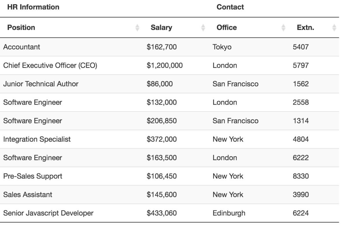
Example of a data table with css:
The problems
There are a lot of headaches we encounter when building tables, and I imagine most of you reading this article will nod along to every point I make; it will be something that will have annoyed us all at some point or another. What this particular (and very specific) problem boils down to is trying to consistently format, size and align complex data layouts across multiple tables. Imagine a financial report; loads of tables of data with differing numbers of cells and columns that—from a purely aesthetic perspective—need to line up in some neat, coherent fashion. Achieving this is made very difficult by a number of different factors…
Cell widths
Tables lay out their cells—by default—in a rather unusual, almost haphazard way. There seems to be no rhyme or reason behind how and why they are rendered at the widths they are, which leads to columns and cells of differing sizes.
Spanning cells
In order to have cells span several columns (and rows, but that doesn’t pose the same problems), we have to use the colspan attribute. To have a cell spanning two columns we would write <t[h|d] colspan="2">. These are often unmanageable, and it can be confusing to remember what all your colspans should add up to.
Knock-on effects
Resizing one cell in one row can, and usually will, affect the layout of the entire table. This is is because all cells’ boundaries have to line up with the boundaries of the rest of the row and column in which it sits. You can’t just change the width of one cell, you have to change them all. This means that, for example, spanning one cell across xcolumns might mean having to update a whole load more colspans elsewhere in thetable.
Tables next to tables
The above problems are further compounded when you begin laying out multiple different tables on any given page. In Sky Bet world, this was pretty much every page. One table’s rendered layout might be vastly different to the tables above and/or below it, creating an unsightly mess of misaligned columns. You might have a tablewith no colspans above a table with some colspans, above a table with lots of awkward colspans. You might have a table with lots of cells above a table with very few. You might have any combination of amounts of cells and amounts of colspans. It all gets very hairy, very quickly.
Solution
I’ve come up with what I feel is a solid, very pragmatic solution.
There are two parts to solving this problem. Firstly we need to standardize the number of cells in every table, and then we need to force these cells to all be the same width. Think of this as a grid system for tables.
24 cells
Think about page layouts that adhere to a grid system; you might have a 24 column grid, but your page might only have two main columns which span, say, 16 and eight columns respectively. You can’t see the 24 columns, but they’re there. You might then have a large footer broken into three columns of eight (again, adding up to 24).
We need to apply this model to tables; we shall give all tables 24 columns, and then use a generous amount of colspans to knock our cells through into each other, into more useful layouts. Now every table we build will be based on a 24 column grid which will, firstly, make everything more consistent, and, secondly, it will make our maths much simpler. We just need to make sure every row’s colspan values add up to 24 every time.
This does mean that every cell in the table now has to carry a colspan, but as I said, this solution is a pragmatic one.
The reason we pick 24 is because it can take halves, thirds, quarters, sixths, eighths and twelfths; we can make a lot of layouts if we have 24 columns to play with.
Now, we would write this snippet:
...
    <th>Column one</th>
    <th>Column two</th>
    <th>Column three</th>
...
as:
...
    <th colspan="8">Column one</th>
    <th colspan="8">Column two</th>
    <th colspan="8">Column three</th>
...
For all this is more markup, it does mean we can begin to standardise our tables’ layouts so that multiple tables on the same page can share a lowest common multiple and are now able to be aligned to one another.
The short version of this section is basically: we are setting up a grid system for ourtables.
Equal width columns
It’s all well and good that all our tables have the same number of columns, but that doesn’t escape the fact that browsers will still render every table differently, and that the size of these cells will always vary. There’s no point having a 24 column table-grid-system if each column is a different width. Thankfully, this is the easiest part of the puzzle to solve and, probably, the most interesting part of this article: table-layout: fixed;.
Now it’s time to tame a data table with css.
There is a little known, and even less used, CSS property called table-layout. table-layout basically tells a browser how to render the columns in a table, and is, by default, set to auto. auto means that the browser will automatically render the cells in a table based on their width, which leads to the differently and inconsistently sized columns.
Interestingly, table-layout: fixed; is the backbone of my pure CSS, equal-width tabs.
Setting table-layout to fixed however, tells the browser to render every cell the same width as each other. Equally-sized table cells right out of the box!
Combining the two
By giving our tables a common grid system of 24 columns, and ensuring these columns are all of equal width, we can begin throwing together all manner of layouts.
I would propose that you opt into the table-grid-system via a simple helper class, perhaps .table-grid:
.table-grid {
    table-layout: fixed;
}
Every time we want to build a table to a fixed and consistent layout, we simply invoke the grid and lay it out to that.
Hopefully now you’ve gained an edge and can control a data table with css on your project(s).


